Friday, July 31, 2009

What I learned at the Hershey Show

Went to the Hershey, PA show as an attendee and tried to learn more about this crazy business. Took notes, and took some photos to share with the ladies at Quilters' Remedy. We're both going to be selling at the PA National Quilt Extravaganza in Oaks in September. The more good ideas we can get, the better! Hope we'll see you there!


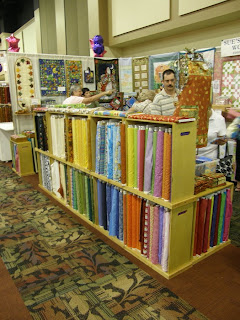
Pods for fabric bolts, with handle cutouts to make them easier to carry.

Halogen track lights with goose necks. Problem with these is how to mount them if you don't have overhead bars.

Overview of a booth with great antique quilts, and a good view of the use of skirt hangers. Booths at this show are 8' deep.

Wednesday, July 22, 2009

The advertisement is up! (click this title)

Yikes! the long-awaited day is here. The video ad on-line at qnntv.com for DippyDyes is up and running. Bless them, they found it interesting and educational enough that they even super-sized it! It was loads of fun to make, plus you get to see the quilt I finished earlier this year. (OK, the binding is still only basted.) Make sure you click on the little 4-way arrow button next to the slider to make the picture full-screen. Woo-hoo!

More credit where credit is due: the quilt blocks are designed by Jane Townswick, and will be included in her upcoming book 'Artful Applique II' due out in the fall. The quilt was quilted by Barb Persing, and the setting was found in the book 'Setting Solutions' by Sharyn Craig.

Tuesday, July 21, 2009

Inspired by Daily Visuals

Took a look at Jane Dunnewold's Daily Visuals blog again. There's a picture of hostas on it that reminded me of a picture I took several years ago. Here's the original picture, plus two cropped versions. The white bits are apple blossoms, mostly. What do you think? Thanks!


More on flat dyeing and other things

A big thank-you to the folks who commented here or by email regarding the flat dyed samples. Just to clarify, I'm not taking the class with Nancy, I'm just helping friends with their dyeing. Doing the work did prompt me to get her two recent books 'Nancy Crow' and 'Crossroads' out of the library. I enjoyed looking at her work, and especially seeing her inspirations translated into cloth. Last year I took 'Dyeing to Discharge' with Carol Soderlund at Nancy's, and got to see her students' work in process upstairs when we took breaks. (Click on the subject list, below right, for links to my posts on that class. Then sign up for it!) The small samples were done with proportions from the Color Mixing I class, but only two primaries. Looking at the recipe book reveals that if you disregard value differences there are about 11 different ratios for two colors mixed together. Because of my fondness for discharge, I was trying to flat dye the darkest samples I could. I did get a question about the texture; it's the result of putting the dye on with a plastic pipette. It struck quickly in the center of each pool, with white/light areas around it. I used a squeegee to move the colors around, out from the areas where I applied it. That was an effort to minimize the white areas. The other thing I want to try is an 11-step color gradation, using those different proportions, and pure colors at either end. Then try the same thing with mixtures. Oh, to be able to dye all day, every day!

On a sad note, the dog is no longer with us. He got almost five months which he seemed to enjoy before illness caught back up with him. So we have a less hairy, much quieter house. Here's a picture of Dudley that captures a bit of his silly nature.

On the up side, another friend is coming in to dye on Thursday & Friday. And she recently returned from Color Mixing 2, so I'll get a preview of that class. If I do OK at the fall shows, I hope to take a disperse dyeing class; will post on that if it happens.
Thanks for looking!

Monday, July 13, 2009

Dyeing solids

Got some work done a couple weeks ago with a friend, helping her dye some yardage for an upcoming class with Nancy Crow. Am I being too obsessive? The solid shade dyeing seems a bit uneven, but it also doesn't look like commercial fabric. The rosey piece is the worst one of the bunch - click on it to see a larger view. Those of you who have taken strip piecing with Nancy Crow, please let me know what you think.

Now to follow up on my last post, I have washed out and ironed the flat-dyed fabrics I was sampling. This picture shows several of them overlapping. The top one has the most varied areas; they're all textured more or less, but none have the usual crystalline LWI effect. What about these for the strip piecing classes?

Thanks very much!

Tuesday, July 07, 2009

Experimenting

Have spent some time over the long weekend experimenting with disperse dyes on polyester (a post for another day) and flat dyeing, using a different set of primaries. Also trying to resurrect a barker, using the same primaries. And a new fabric that turned out pretty nice!

Here's a picture of 11" samples I did using the flat dyeing technique written about by Robin of QuiltAntics at http://quiltantics.blogspot.com/2008/04/flat-dyeing.html. Thanks, Robin. The primaries are Turquoise, Golden Yellow, and Boysenberry (Pro Chem names.) The pictures show the fabrics batching under plastic. I was going for a deep depth of shade, and started by measuring how much liquid the dry fabric could hold. Then I mixed my recipes and applied the colors - a total of about 15 ml of dye for each 11" square. When they have had their final washout and ironing, I will post again. Did find a hole in the new vinyl that I used between the layers. I get about 10 yards at a time at JoAnn with the coupon.


Here's a before and after in one shot photo of the reviving attempt:
The section on the left is fabric I flag-folded between wooden triangles, tied tightly and dyed with a mix that included the creepy turquoise. Not very nice, in my opinion (or fugly, if you'll excuse the expression.) On the right is a half-yard section I tore off and did LWI in a mix of equal parts of the above primaries, aiming for 10 -12% DOS. I rather like the crystalline LWI markings with the bound shibori showing through. Again, it hasn't had it's final washout, but it's good enough to test for discharge. If I decide I want to!
Finally, I have a picture of a 100% cotton Jacquard weave from Robert Kaufman that I dyed - same primaries, no surprise there, but just golden yellow with a hint of boysenberry. This was done full immersion. I think it's a little warmer in person than in the photo, and the flash really highlighted the weave more than in person, too. But it's lovely stuff. I will be adding it to the 'PFD' category at http://www.dippydyes.com/ - anything to make a buck to support this habit! It's not technically a PFD, but I did nothing to it before dyeing - no scouring, prewash, whatever, and I think it came out fine. Haven't done any LWI on it yet; I think the two kinds of patterning might fight each other. That is, the crystalline markings from dyeing and the woven pattern.

So, that's it for tonight. Please post a comment if you have one! Thanks.