Various pictures of the season. There's color inspiration everywhere. The transparency samples are not an autumn colorway, but they are what I'm working with right now. I love seeing how the different backgrounds make the colors change.


Here's my first picture from the class I took earlier this month at Pro Chemical & Dye. It shows a series of skinny quarters, each with an increasing number of layers and colors of dye. The last two have the same number of layers, but the top one was folded twice as much. Loved this class!

Took a photo of my upgraded methods to test for bleeding.
1- fold a piece over and iron between white fabric
And
2- throw a white swatch into the hot wash to look for bleeding in the washer


 Yesterday I spent a lot of time in the studio. I'm dyeing the fabric for a whole-cloth quilt that will go into the teacher's row at the Mid-Atlantic Quilt Festival next month. It's inspired by the work of Alma Thomas, and you can see a study for it in the Painterly Class sample picture below.
 The second picture shows some of the blocks for a quilt I'm working on. Started working on these 10 years+ ago, and they finally are all done - 257 of them. I did a test drive of the layout a few months or more ago, so when I did the layout this week, it only took a couple hours to fiddle with it. You can see some paper ID tags sticking off the corners. So now I'm assembling the top - four blocks in all 16 rows are joined. And I'm chaining the whole thing, unless it gets massively unwieldy, but I know that all the blocks, rows and columns are in the correct position that way. And I'm going to quilt it on the household machine, so I'd better get used to unwieldy!
 The third picture shows the detail of another piece dyed with vat dyes - first in a purple bath, then printed with thickened grey dye. You need to enlarge it to see the coppery halo around the grey printing. I like it!
 Second is a piece of snow- dyed fabric that I printed with a screen created with bubble wrap. Easier and more predictable than printing with the wrap itself, as well as tidier.
 a major learning experience. Just above and to the left of center is a dark slit that shows how silk isn’t happy with prolonged periods of high pH and high temperature, especially when followed by a normal cycle machine wash. When I do this again with silk, I will only process the fabric one time!! This one had two cycles through the pressure cooker. The last picture shows a larger view of the fabric. The blue-violet areas were screened while the black circles were directly applied. Because of the density of the circles, you can see the halo really well.
 The directions from Pro Chemical that I followed are found here. They advise that it is an intermediate to advanced technique. For a simpler approximation, try deColourant. I cleaned a screen with water squeegeed through onto a floor mop-up towel. It discharged by just hanging in the sun, the way deColourant does.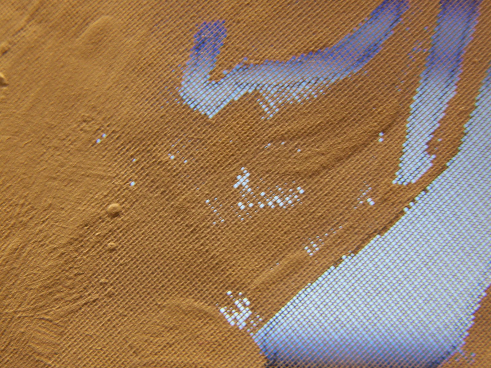
Thursday, January 2, I got samples of 15 fabrics from Robert Kaufman. I added some other white/PFD fabrics I had on hand and dyed all of them in a single 10% OWG dye bath. the results are above, sorted with the darkest results at the bottom left and worst on the upper right. I have added the Kaufman white fabrics to my website, plus color choices of Kona®, Radiance and Utra Sateen if you want to order a bolt.
The left column starts with 400M and 419M from Testfabrics at the top. I scoured samples of everything, including those two, and they are on the left of each pair. These came pretty dark, but weren’t the darkest. Hampton Twill is next, then Essex (55% Linen/45% Cotton), then Organic Wide (57”-58”), then Ibiza Stretch Twill. The latter came out the darkest, and contains 3% spandex. It’s basically stretch denim and weighs 7.3 oz/sq yd.
The middle column starts with Ultra Sateen, which is not PFD, but dyes beautifully. Not a big winner in this experiment, but is great for other uses, like LWI and dye painting. And it comes in 11 other colors, too! Next is Organic Voile – 100% cotton and great for shibori and vat dyeing, as it’s very sheer. There’s only one sample here – I left the scoured one in the washer. Brussels Washer is 55% Linen, 45% Rayon and looks like linen; I thought the color shifted a little towards the red in this sample. Pimatex and Patina are the next two, and Kona is at the bottom of the column. It also comes in another 270 colors!
The right column includes Organic Poplin, Pure Threads Dyer’s Cloth from James Thompson Co, Cambridge Lawn, 21-Wale Corduroy, which is from an old lot but is still available. Then there’s Laguna Jersey, Kona 60 and ‘Cherrywood’ muslin. The muslin samples were both prewashed; the one on the left also went through the scour cycle with the others. The muslin is on the website too, by the yard.
The far right are some miscellaneous fabrics, as follows:As of this writing, 2/9, the Laguna Jersey is no longer on the Kaufman site. One fabric that I didn’t test is a bleached white muslin from Robert Kaufman, and there are dozens more – for next time! I hope you’ll see something you’d like to try – just click on the links to shop.


Most of these are monoprints, and one is a screen print from a screen made with polyester mesh and house paint. The latter is a new technique for me, but it seems to have a lot of possibility. Now I just need to make up some more frames.
This is a monoprint with several varieties of “black.” The colors all started with some black dye mixed at 5% and thickened. That’s not really strong enough to get a good print. The grey is mixed with 1% black dye. Then I added tangerine to one cup, and orange and blue to another. A third cup I added blue only to – a very nice blue-grey was the result.
This is the blue-grey, with ‘telephone dials’ that are the result of dropping a metal palette into the dye. The first time I did that was by mistake and I liked the pattern a lot.
The first of these two pictures is a monoprint using the various different blacks I had mixed up. The second is a ghost print with some more dye added, I think.

This was made with stronger black dye using the screen I made with house paint. It was inspired by the print from the palette. A lot of the rough areas could get tidied up. Maybe I will just make the circles crisper, though.
Since I had thickened black and navy MX dye, here’s some more of what I did:
Black circles monoprint, lower right, and a ghost print from the same surface on the left.
Since I mixed up guar gum for use in the devoré paste, I took a little and squished it on fabric. It was very thick; not too different an end result than I’d expect from using print paste as a resist.
Three elements in this photo: in the upper left is plumber’s putty, or the poor dyer’s gel plate.Yes, it’s oily, but I haven’t noticed any staining on cotton. The yellow at the bottom is a big veggie sack – I pressed that into the putty with a roller (pipe.) The resulting fabric is in the upper right – a piece of pink snow-dye with spots of thickened navy dye. The dye was not as thick as it might have been, so I saw it beading up on the surface of the putty. Definitely doing more with the putty.
OK, all these photos were taken over the course of several day’s work – they’re not all from today.


So it has been overdyed with navy. Next step: vat dyes!

This picture shows a scarred piece of polycarbonate with thickened black dye at one end.
Here are a couple prints that were made from that piece of polycarb. Probably a close-up would help – the circles are pretty fine, and interesting, I think.
 Here are my tests of the ombre on silk commission fabric. The right-hand piece is my first large test for color; on the left is the second large test of color plus the ombre effect, and in the middle is a tiny blue rectangle that’s my color/value to match for the darkest area. It’s one of those blues that changes drastically according to the light source.

 dyed broadcloth that I used for a test of Corn Dextrin resist. The dextrin was a little too warm and thin when I applied it, so it resisted really well. However, in this white area I used my pink centipede to remove some of the dextrin, so there are some darker areas created where its legs touched.
  This is half of an ugly challenge fabric from last year, or early this year. I used it to get practice with potato dextrin. Again, too warm and thin; the best results are from an earlier application of dextrin
 .
. Thanks for looking!
My post from the 29th is about my decision to stay home from the craft show in Virginia. Since then I’ve spent a lot of time tidying and putting things away in the studio, so I have room to work. And most of the past three days I’ve been practicing and experimenting and learning more about some techniques I’ve underutilized. So here are some photos, just of the devoré so far:
This is a picture of a poly-cotton blend fabric. I’ve screened devoré paste on the fabric through a Thermofax screen, let it dry and then ironed it. Once ironed, I washed out the cotton portion of the fabric, leaving the poly behind.
Here’s the same fabric after washing out the cotton. It’s held up to the light because that’s the best way to see the resulting pattern.
Here’s a look at testing the pH of the devoré paste – gloves are a must! If you’re not up on your pH numbers, 7 is neutral, soda ash is alkaline, about 11 or 12, and vinegar is 2.4 – 3.4 according to this site.


 Posts
All Comments
Posts
All Comments


