Saturday, December 28, 2013
From spoiled to productive
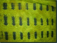
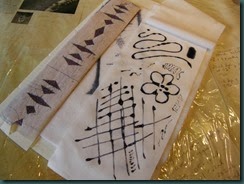
So I have been working on some of the exercises from ‘Visual Language’ and have created a hand-painted stencil to use with a silk screen. Here’s a picture of the first three prints I pulled through it.
And this is a detail of the first print I pulled, showing the moiré effect created by printing through two layers of sheer cloth. That alone is an exciting discovery, I think.
Wednesday, November 27, 2013
A few prints
Most of these are monoprints, and one is a screen print from a screen made with polyester mesh and house paint. The latter is a new technique for me, but it seems to have a lot of possibility. Now I just need to make up some more frames.
This is a monoprint with several varieties of “black.” The colors all started with some black dye mixed at 5% and thickened. That’s not really strong enough to get a good print. The grey is mixed with 1% black dye. Then I added tangerine to one cup, and orange and blue to another. A third cup I added blue only to – a very nice blue-grey was the result.
This is the blue-grey, with ‘telephone dials’ that are the result of dropping a metal palette into the dye. The first time I did that was by mistake and I liked the pattern a lot.
The first of these two pictures is a monoprint using the various different blacks I had mixed up. The second is a ghost print with some more dye added, I think.
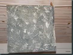
This was made with stronger black dye using the screen I made with house paint. It was inspired by the print from the palette. A lot of the rough areas could get tidied up. Maybe I will just make the circles crisper, though.
Thursday, November 14, 2013
Home again, and some news
My friend Karin is in the guild, and I stayed the night with her, and we talked quilting, fabric and dyeing most of the time we were awake. I also spoke about my business and the recent craft show experience. One goal with a real deadline was applying for state-wide juried status with the Pennsylvania Guild of Craftsmen. So, the deadline is tomorrow, November 15, and I got my submission done today! And, by the way, I have already been juried at the Lehigh Valley Chapter level.
One of the quilts I am submitting for jurying is not currently in my hands. It is with Shannon Shirley, and it is going to be included in an upcoming book to be published by Schiffer Publishing. But if I am selected for the jurying session (no guarantees) I'll be able to get the quilt here in time. And the really cool part is that Shannon told me it will be included in the exhibit at the upcoming Quiltfest Destination Savannah in the end of March, 2014. Keep your eyes open for it, and I'll post a picture of it on this site when the exhibit is unveiled.
Monday, November 11, 2013
Post 3 – missed these yesterday
Since I had thickened black and navy MX dye, here’s some more of what I did:
Black circles monoprint, lower right, and a ghost print from the same surface on the left.
Since I mixed up guar gum for use in the devoré paste, I took a little and squished it on fabric. It was very thick; not too different an end result than I’d expect from using print paste as a resist.
Three elements in this photo: in the upper left is plumber’s putty, or the poor dyer’s gel plate.Yes, it’s oily, but I haven’t noticed any staining on cotton. The yellow at the bottom is a big veggie sack – I pressed that into the putty with a roller (pipe.) The resulting fabric is in the upper right – a piece of pink snow-dye with spots of thickened navy dye. The dye was not as thick as it might have been, so I saw it beading up on the surface of the putty. Definitely doing more with the putty.
Sunday, November 10, 2013
All the stops, post #2
OK, all these photos were taken over the course of several day’s work – they’re not all from today.


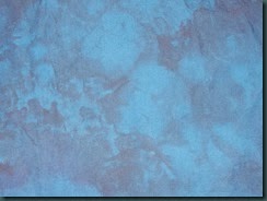
So it has been overdyed with navy. Next step: vat dyes!
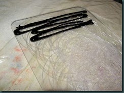
This picture shows a scarred piece of polycarbonate with thickened black dye at one end.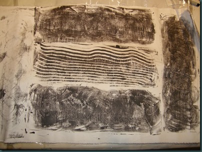
Here are a couple prints that were made from that piece of polycarb. Probably a close-up would help – the circles are pretty fine, and interesting, I think.
 Here are my tests of the ombre on silk commission fabric. The right-hand piece is my first large test for color; on the left is the second large test of color plus the ombre effect, and in the middle is a tiny blue rectangle that’s my color/value to match for the darkest area. It’s one of those blues that changes drastically according to the light source.

Here is a piece of snow-
 dyed broadcloth that I used for a test of Corn Dextrin resist. The dextrin was a little too warm and thin when I applied it, so it resisted really well. However, in this white area I used my pink centipede to remove some of the dextrin, so there are some darker areas created where its legs touched.
  This is half of an ugly challenge fabric from last year, or early this year. I used it to get practice with potato dextrin. Again, too warm and thin; the best results are from an earlier application of dextrin
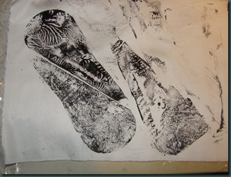 .
. Finally, this is very thick black MX that was spread on the smooth side of the polycarbonate shape used above. Another petal-shaped piece of plastic was used to squish the thickened dye and lift it off. I was reminded of this technique by Sue S in the UK, and I love it! I’m glad I used an interesting shape, too!
Still on the list of stuff to play with – discharge/vat dye, if it’s nice tomorrow afternoon. Must bind up the orange/navy for that.
Thanks for looking!
Saturday, November 09, 2013
Pulling out all the stops weekend, part 1
My post from the 29th is about my decision to stay home from the craft show in Virginia. Since then I’ve spent a lot of time tidying and putting things away in the studio, so I have room to work. And most of the past three days I’ve been practicing and experimenting and learning more about some techniques I’ve underutilized. So here are some photos, just of the devoré so far:
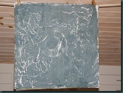
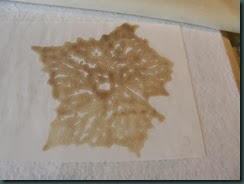
This is a picture of a poly-cotton blend fabric. I’ve screened devoré paste on the fabric through a Thermofax screen, let it dry and then ironed it. Once ironed, I washed out the cotton portion of the fabric, leaving the poly behind.
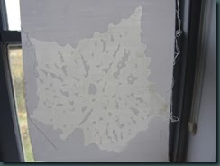
Here’s the same fabric after washing out the cotton. It’s held up to the light because that’s the best way to see the resulting pattern.
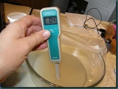
Here’s a look at testing the pH of the devoré paste – gloves are a must! If you’re not up on your pH numbers, 7 is neutral, soda ash is alkaline, about 11 or 12, and vinegar is 2.4 – 3.4 according to this site.
Tuesday, November 05, 2013
Thinking about Intent
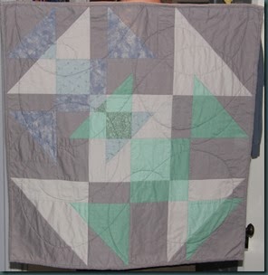
This is probably my first completed art quilt.
It was made for a guild challenge in 2002, and won a prize for best original design, I think. The challenge, as you may guess, was to work with the Shoo-Fly pattern. I had also learned a little by that point about transparency and wanted to try using that in a quilt. I’m still proud of it – I accomplished what I set out to do: finish a quilt for the challenge – and I think it exceeded my expectations once I saw it all together.
Some months later I realized that the resulting quilt was also a piece of mourning for the events of September, 2001. The colors are somber and the quilting made me think of ashes falling. Not part of the intent, and the quilt stands alone fine. Is it art? Is it better for having a title? I don’t know, but I still like and am proud of the quilt. Thanks for looking – Lisa
Tuesday, October 29, 2013
The show that wasn’t
Recently I posted on some of the several lists and groups I belong to asking for feedback on whether or not to vend at a fine craft/art show. Here’s what I wrote:
I just got back from a fine craft show for which I wasn’t prepared. The booth cost $100 and I sold $55, and I slept at home. I didn’t promote it to my mailing list. There’s another one November 8-10; DH thinks I should stay home and I’m on the fence. I’ve already paid out $400, but if I go, there’s lodging and travel (which is painful for hubby) – say another $500, plus a door prize that I’d have to make. I can learn from my mistakes and advertise it to the folks on my mailing list – there are lots in the area – and go there anyway and take a chance. Will quilt show attendees come to a fine craft show?
I got a lot of great feedback on both sides of the question – 33 emails and a phone call. Thank you so much to everyone who took the time to reply. The bulk seemed to be on the ‘stay’ side; on top of which I went to the show’s website and Facebook page, which in my opinion didn’t do anything to instill confidence. Plus there’s another show with a similar name about 80 miles away that is competing head to head for a lot of the same attendees.
The final result – I decided to stay home and work. I told hubby he could feed me. (Is that just cashing in too much on his guilt?) Then I told him seriously – “let’s try another, bigger show that’s close to home.” And of course, we’ll be at Hampton, VA and Somerset NJ in the late winter again next year!
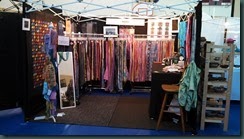

Here’s a new idea – matted pieces of fabric displayed on an easel. One of the good ideas I picked up at the Allentown show.
The show was very nice, and many vendors had good sales. Maybe next year I will too! Thanks again to those who responded, and thanks for reading!
Friday, June 14, 2013
Fabrics
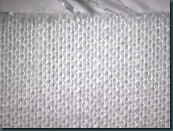
In 2011 I had access to a photographing microscope, so of course I had to take pictures of fabric. The first is cotton sateen, and I think it’s very interesting. The rest are cool, too. My descriptions are not at all technical, and might be wrong. It’s just what I’ve picked up over time. I dye, I don’t weave.

Sateen back – selvedge on the left.
Broadcloth – the basic over 1 – under 1 plain weave we learned making potholders.
NuSuede polyester microfiber – the smooth back.
Radiance cotton-silk sateen. This is the back cotton side.
Radiance – the front / silk / warp side.
Saturday, June 08, 2013
Results from washout
Friday, May 10, 2013
Pleased with myself
OK, Mom & Dad always said “Don’t break your arm patting yourself on the back.” But my deadlines for the week are over and I’ve made some good progress. 
My other deadline was for jurying into ArtsyShark. They base their decision on products that are posted on-line – both on the website and on Etsy. In the course of doing that I had the web guru update the look of my site, and then I added or updated 32 fabrics. None are solids like the ones I do for Kate. And then I learned how to add ‘Share’ buttons to product pages. The selection process has begun – they expect to notify us next week. And today the featured artist is Wen Redmond!
Got to talk/email/text with my sister a few times this week. She is in week 1 of retirement, and busy cleaning out the attic. Way to go!
Tuesday, April 30, 2013
Fan-fold pleater details
The first picture shows an over-all view with a yardstick for scale.
 The second picture shows a closer look at the back side.
 Here’s a close-up of the front. The red line is the center from end to end, the lighter blue lines are on either side of the center slot. That helps me start my fabric in the middle of the pleater if I choose, and, if I want to help keep it square, I can put a crease down the center of the fabric and try to keep it in line with the red mark as I pleat.
 The last picture shows an end view with the slats spread open.
 The wood I used was actually dollhouse siding, and hubby donated it because he was never likely to use it for anything. Any wood, including light (1/4”) plywood would work fine. You’d need to sand it well to smooth it. If you used plywood, it could be cut from a 4’ width of material.
The fabric I used for the back was canvas or a heavy denim. Again, it was what I had laying around, and it was old and 36” wide. I then glued and stapled it to the slats. The staples are in the bottom of the face of the board, rather than trying to staple into the skinny edge. The glue I used was probably Elmer’s, and I would change that to a silicone or rubbery adhesive. White glue dries too stiff.
When I use it, I push the fabric down into the slots with a plastic drywall spatula. A credit card or other flat squeegee tool would work.
PS – please help my with my business wish by voting at http://bit.ly/15nmMG8 . Totally anonymous, and it will helps towards a chance for me to go to the Houston shows in the fall. That trip will be so expensive that I doubt I could make enough money to break even.
PPS – if you haven’t, and want to, please sign up for the DippyDyes mailing list.
Saturday, April 20, 2013
Learning Photography Again

OK, enough words, here are three pictures of buttons.** Both are straight out of the camera with no editing or correcting of any kind. The first is typical of most of my pictures, though I usually crop out the camera shadow. That was taken under the studio halogens.
 For the second picture, I moved the buttons to my storeroom and staged them on a tee shirt that’s awaiting dye. I installed some hideously bright ‘Daylight’ CFL bulbs in the ceiling fixture this week. Annoying for lots of things, but very good color for photographs. On my monitor, the color is better, but still not right.
The third picture is one that I have tried to improve the color on. The color of the blue button is better, but the other two, and the white background have too much of a yellow cast. Does it still have a way to go? Absolutely. Is it better than the first picture? Yes! Do I still have more of the Craftsy class to work through? You betcha!
 **About the buttons: these are the Swirly Girls’ Monogram buttons from Dill. They sent me some in white that I’ve dyed. The blue button was ‘immersion’ dyed in 1/4 teaspoon of disperse dye stock in a canning jar in the autoclave. The green one was painted with slightly thickened dye, put into a canning jar as is and processed at the same time as the blue button. The grey-green one was painted with the same dye as the green button. The first difference is that I cleaned the button before painting; the second difference is that it had not been processed yet! That’s how the green color starts out. The next thing I have to try is a heat transfer press onto a button. Watch this space!
Friday, April 19, 2013
The Brass Ring & Economics of Quilt Show Vending
Right now, getting to Houston and back, paying for the booth/s, having reliable transportation, etc, will cost over $3000 before I make a single sale. For an idea of how that compares, I did a summary of the three shows I vended at this spring. After subtracting booth fees, hotels and mileage, my gross profit was about $2800. Subtract the estimated cost of good sold, and the net profit comes to about $640. Remind me why I’m doing this again?? Well, I know why, but it’s certainly not logical with such low profits. Committing to going to Houston on my own looks even less logical – it’s great advertising, but not a real profit-making venue. So, I can try for the brass ring (now I AM dating myself), or never go to vend at Houston, or build up to it as a “few years down the road” goal. Can’t hurt to try! Thanks for your support.
Sunday, April 07, 2013
Gender and ignorance (and humor)
Just found this draft – it was going to be a reply to a post on QuiltArt in January 2011, but my mind started wandering down so many avenues I didn’t know where to start. I (and my husband) have often been entertained by different incidents relating to being the ‘wrong’ milieu. It helps to know that I am tall – close to 6 feet, and live in jeans and other unisex clothes. (Is that word still used?) More than once I have been called ‘sir’ by someone who didn’t look closely, or high enough, when I was at a typically male environment. Then there are the times that women gasp when they see me in the ladies room – it embarrasses them, and I figure I can laugh at them freely.
One big part of life for me and hubby has been Bahr’s Mill, a 19th century woodworking historic site. It’s an amazing place – the sort that looks like the operators closed the door 75 years ago and left it untouched. We have worked there and given tours to thousands of people. Lots of times someone will ask hubby a question that he has to refer to me, which confuses the visitors to no end.
Now he has moved into the quilt show world with me, and he always
When men come into my booth I try to treat them like other customers, but I find that it can be tough. That’s my fault, and I certainly don’t want to insult anybody.
Fast forward to 2013 – I just got home from the Creative Arts Business Summit, and we had a speaker discuss how we present ourselves. She suggested fitted tops that are flow-y, not fitted, and that I can wear comfortably over my jeans. And to wear my scarves – around the neck or the waist. So I’ll give it a try! Keep an eye here to watch the other results of the summit!
Thursday, March 07, 2013
A Tale of Two Uglies


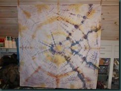


Here is the fabric in a tote with thickened dye spread across the pleats in stripes. I think I used an old tin can with both ends removed to hold the thickened dye. Uglies are great to experiment with.
After batching, this is how it came out. A good illustration for an experiment, but still blah.

Thanks for looking, and don’t forget to stop by and say Hi at the Lancaster Spring Quilt Show at the Host Hotel and Resort. The show runs 3/13 – 3/16. If you sign up for our mailing list, you will get a admission discount coupon, and a DippyDyes discount coupon. Thanks!


