Wednesday, November 27, 2013

A few prints

Most of these are monoprints, and one is a screen print from a screen made with polyester mesh and house paint. The latter is a new technique for me, but it seems to have a lot of possibility. Now I just need to make up some more frames.PB270019

This is a monoprint with several varieties of “black.” The colors all started with some black dye mixed at 5% and thickened. That’s not really strong enough to get a good print. The grey is  mixed with 1% black dye. Then I added tangerine to one cup, and orange and blue to another. A third cup I added blue only to – a very nice blue-grey was the result.PB270017

This is the blue-grey, with ‘telephone dials’ that are the result of dropping a metal palette into the dye. The first time I did that was by mistake and I liked the pattern a lot.PB270021PB270022

The first of these two pictures is a monoprint using the various different blacks I had mixed up. The second is a ghost print with some more dye added, I think.

PB270020This was a mixture of all the leftover blacks, with areas of color removed using a small sea sponge.PB270016

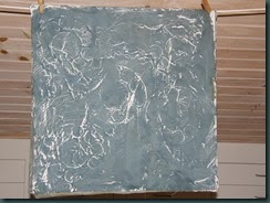
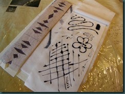
This was made with stronger black dye using the screen I made with house paint. It was inspired by the print from the palette. A lot of the rough areas could get tidied up. Maybe I will just make the circles crisper, though.

Thursday, November 14, 2013

Home again, and some news

Last night I spoke at the meeting of the Berry Basket Quilters in Medford, NJ. My usual speaking engagement is a trunk show, starting with some early quilts, and ending with the latest quilt in the works, with lots of hand-dyed fabric in between. It was fun, because I can always talk dyeing!
PA Guild of Craftsmen logo
My friend Karin is in the guild, and I stayed the night with her, and we talked quilting, fabric and dyeing most of the time we were awake. I also spoke about my business and the recent craft show experience. One goal with a real deadline was applying for state-wide juried status with the Pennsylvania Guild of Craftsmen. So, the deadline is tomorrow, November 15, and I got my submission done today! And, by the way, I have already been juried at the Lehigh Valley Chapter level.
One of the quilts I am submitting for jurying is not currently in my hands. It is with Shannon Shirley, and it is going to be included in an upcoming book to be published by Schiffer Publishing. But if I am selected for the jurying session (no guarantees) I'll be able to get the quilt here in time. And the really cool part is that Shannon told me it will be included in the exhibit at the upcoming Quiltfest Destination Savannah in the end of March, 2014. Keep your eyes open for it, and I'll post a picture of it on this site when the exhibit is unveiled.

Monday, November 11, 2013

Post 3 – missed these yesterday

Since I had thickened black and navy MX dye, here’s some more of what I did:Monoprinted circles

Black circles monoprint, lower right, and a ghost print from the same surface on the left.Test of guar gum as a resist

Since I mixed up guar gum for use in the devoré paste, I took a little and squished it on fabric. It was very thick; not too different an end result than I’d expect from using print paste as a resist.Experiment with plumber's putty, a corn sack and thickened MX

Three elements in this photo: in the upper left is plumber’s putty, or the poor dyer’s gel plate.Yes, it’s oily, but I haven’t noticed any staining on cotton. The yellow at the bottom is a big veggie sack – I pressed that into the putty with a roller (pipe.) The resulting fabric is in the upper right – a piece of pink snow-dye with spots of thickened navy dye.  The dye was not as thick as it might have been, so I saw it beading up on the surface of the putty. Definitely doing more with the putty.

Sunday, November 10, 2013

All the stops, post #2

OK, all these photos were taken over the course of several day’s work – they’re not all from today.

Devore on polyester testThe first picture shows the results of yesterday’s devoré plus disperse test. The dye looks blackish-purple before heat-setting, and the pink seersucker burned out very nicely. The pink color comes from MX.

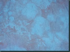
Orange snow-dye
Navy over orange snow-dyeNext is an piece of orange snow-dye. Not bad, just a little boring.
So it has been overdyed with navy. Next step: vat dyes!
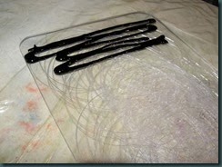

Trying ink on scarred polycarbonate
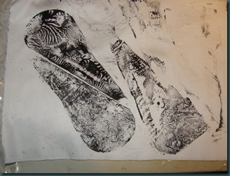
This picture shows a scarred piece of polycarbonate with thickened black dye at one end.Prints from scarred polycarbonate
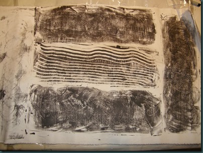
Here are a couple prints that were made from that piece of polycarb. Probably a close-up would help – the circles are pretty fine, and interesting, I think.


Ombre testHere are my tests of the ombre on silk commission fabric. The right-hand piece is my first large test for color; on the left is the second large test of color plus the ombre effect, and in the middle is a tiny blue rectangle that’s my color/value to match for the darkest area. It’s one of those blues that changes drastically according to the light source.


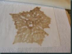
Inko resist testThis is a piece of broadcloth with Deep Navy MX dye. The reason it looks like cheesecloth is that it was a test of my old Inkodye resist. I spread it on, pressed the cheesecloth into it and let it dry. Then it was thoroughly glued down, so I had to moisten it in order to remove the cheesecloth. The resist came away with the cheesecloth.


Here is a piece of snow-Corn dextrin resist testdyed broadcloth that I used for a test of Corn Dextrin resist. The dextrin was a little too warm and thin when I applied it, so it resisted really well. However, in this white area I used my pink centipede to remove some of the dextrin, so there are some darker areas created where its legs touched.
Ugly fabric with potato dextrinThis is half of an ugly challenge fabric from last year, or early this year. I used it to get practice with potato dextrin. Again, too warm and thin; the best results are from an earlier application of dextrinDye squished between plastic shapes.
Finally, this is very thick black MX that was spread on the smooth side of the polycarbonate shape used above. Another petal-shaped piece of plastic was used to squish the thickened dye and lift it off. I was reminded of this technique by Sue S in the UK, and I love it! I’m glad I used an interesting shape, too!
Still on the list of stuff to play with – discharge/vat dye, if it’s nice tomorrow afternoon. Must bind up the orange/navy for that.

Thanks for looking!
Saturday, November 09, 2013

Pulling out all the stops weekend, part 1

http://www.freefoto.com/preview/811-13-7665/Church-Pipe-Organ

My post from the 29th is about my decision to stay home from the craft show in Virginia. Since then I’ve spent a lot of time tidying and putting things away in the studio, so I have room to work. And most of the past three days I’ve been practicing and experimenting and learning more about some techniques I’ve underutilized. So here are some photos, just of the devoré so far:

PB090150

This is a picture of a poly-cotton blend fabric. I’ve screened devoré paste on the fabric through a Thermofax screen, let it dry and then ironed it. Once ironed, I washed out the cotton portion of the fabric, leaving the poly behind.PB090152

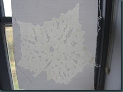
Here’s the same fabric after washing out the cotton. It’s held up to the light because that’s the best way to see the resulting pattern.PB090156

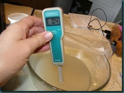
Here’s a look at testing the pH of the devoré paste – gloves are a must! If you’re not up on your pH numbers, 7 is neutral, soda ash is alkaline, about 11 or 12, and vinegar is 2.4 – 3.4 according to this site.

PB090154And here’s the next set of samples. It shows two fabrics with devoré paste mixed with disperse dyes. The results should at least show up better than the second picture does. More later!

Tuesday, November 05, 2013

Thinking about Intent

This is probably my first completed art quilt.

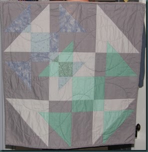
Memorium quilt

It was made for a guild challenge in 2002, and won a prize for best original design, I think. The challenge, as you may guess, was to work with the Shoo-Fly pattern. I had also learned a little by that point about transparency and wanted to try using that in a quilt. I’m still proud of it – I accomplished what I set out to do: finish a quilt for the challenge – and I think it exceeded my expectations once I saw it all together.

Some months later I realized that the resulting quilt was also a piece of mourning for the events of September, 2001. The colors are somber and the quilting made me think of ashes falling. Not part of the intent, and the quilt stands alone fine. Is it art? Is it better for having a title? I don’t know, but I still like and am proud of the quilt. Thanks for looking – Lisa