![]() |
| Impaired |
![]() |
| detail, Impaired |
| Show and tell at pipe-wrapping class |
![]() |
| Impaired |
![]() |
| detail, Impaired |
| Show and tell at pipe-wrapping class |
This is probably my first completed art quilt.
It was made for a guild challenge in 2002, and won a prize for best original design, I think. The challenge, as you may guess, was to work with the Shoo-Fly pattern. I had also learned a little by that point about transparency and wanted to try using that in a quilt. I’m still proud of it – I accomplished what I set out to do: finish a quilt for the challenge – and I think it exceeded my expectations once I saw it all together.
Some months later I realized that the resulting quilt was also a piece of mourning for the events of September, 2001. The colors are somber and the quilting made me think of ashes falling. Not part of the intent, and the quilt stands alone fine. Is it art? Is it better for having a title? I don’t know, but I still like and am proud of the quilt. Thanks for looking – Lisa
I went to the PO box today, hoping to pick up a check. That wasn’t there, but I got something even better – a catalog for a solo show by Kate Stiassni at The White Gallery. (She has pictures of most of the quilts on her Portfolio page.) When I dye solid fabrics, it almost always is for her. Her show continues until January 27. Yay, Kate!
Well, I did my usual last-minute work last week, and got work submitted before the deadline – barely. One was a submission of photos of my quilts for inclusion in Mary Kerr’s upcoming book about art quilts. Of course, I didn’t pay for professional photography, and when I realized I hadn’t taken sufficiently high resolution pictures, my photoflood bulb burned out. And my dog ate my homework.
The second project was a little more understandable, but still somewhat Mickey-Mouse’d. (Oooo, I hope the denizens of Orlando and Anaheim aren’t offended.) Anyway, I have been working on a piece of fabric for about 8 months, contemplating how to add a layer of black over the snow-dyed cloth. My sample piece includes:
About 10 days ago I finally hit on using a potato dextrin resist and thickened dye. Then I washed it out and used thickened bleach over a new application of dextrin. Here’s a picture:
I really, really like the look and want to do both layers again to a large piece of cloth. Problem is I didn’t have time to do that to the piece of fabric for the quilt submission. So that can wait for a future piece. All that said, I do like the look of the final cloth for the quilt. Without more ado, here’s a picture of the quilt, and a detail:
I’m happy with the result, and now I have to wait to see if it is accepted in the Deep Spaces exhibit. Fingers and toes are crossed!
Had fun making these – they seem to be addictive, like I need another one. I will have dyed Peltex and the pattern for making them at the upcoming shows. Still dyeing like a madwoman getting ready for those – over 100 yards of new work and counting!
Hampton, VA, February 24 - 27, 2011
Somerset, NJ, March 3 - 6, 2011
Lancaster, PA, March 16 - 19, 2011
Well after reviewing all the wonderful comments on ‘Can’t let this one go,’ below, I decided it was time to do some virtual design wall stuff. Plus it’s a good way to learn to mess with Photoshop Elements and DrawPlus Starter Edition. Not going to post everything I tried; the items below were worth keeping. Some I like better than others – what do you think?
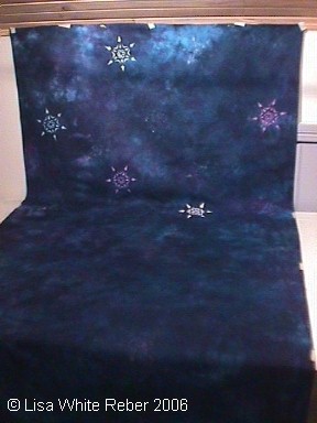
Well, I have been giving some thought to the ‘keeper’ fabric and came up with a decent way to audition Shiva Paintstiks. This illustration shows about the third iteration, and the first I like. The paint for now is temporary – I applied it to Glad Press ‘n Seal™ cling wrap - you can see it best around the top fan. Once the paint has dried thoroughly, I can remove and reposition it all I need. I like how the curvilinear shape of the fans echoes the bound spider webs. Hope you do too. I did test out some intense green, but that might be best in very small bead-sized doses. Thanks for looking!
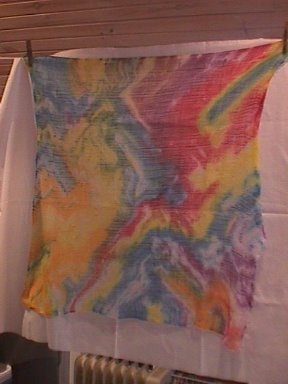
Well, spent a lot of time yesterday doing discharge. That’s in the washer right now, but I wanted to post a picture of this fabric. It turned out really neat, and I’d like to do more with it. I could make a whole-cloth wall hanging out of it and it would be just cloth and stitching. Or I could add more layers of complexity in surface design, or add appliqué - circles, probably. But I did hang it and placed some circles that are already made on it, and didn't like it. So I’m posting this here, and sending a message to the Quilting Art and ComplexCloth folks. FYI – this started out as a dark purple mixed from Turquoise & Fuchsia, and was discharged in bleach (I'm pretty sure.)

Sorry, it looks a little dingy, but the colors and textures are neat. Now to translate them into fabric.
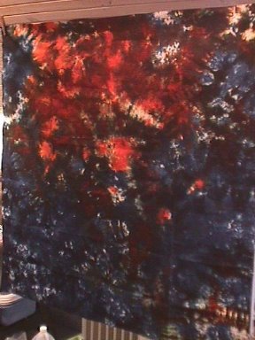
At left is a picture of the cloth in progress. I think it's attractive; anyway I like it a lot more than a lot of the art quilts I see. It isn't going to challenge anyone, I suspect, but I like it. I feel rather like I should apologize for it, but I'm not gonna.

week! Just standard white and ivory fabric, not sparkly stuff like the blue. The detail (second picture) shows a couple starfish – they were printed with a Goyutaku rubber mold from Dick Blick – neat stuff, and not stinky like the not-so-recently dead creatures would be. When I got it, it had been handles so much that it was grey - they're very tactile objects. Some dish soap and spray cleaner took care of the hand prints, and gave it surface tension again.
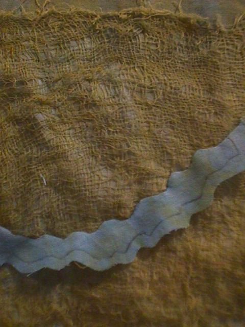
reverse shows the all-over stitching I used to tack it down. If you try this at home, use a rubber eraser to manipulate the cheesecloth, and also do prepared edge appliqué on top, *not* needle-turn. I also made up a sample using machine stitching to hold down the cheesecloth, which will probably get used for foliage. Both work.