OK, all these photos were taken over the course of several day’s work – they’re not all from today.


So it has been overdyed with navy. Next step: vat dyes!

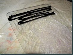
This picture shows a scarred piece of polycarbonate with thickened black dye at one end.
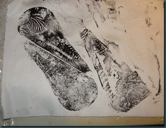
Here are a couple prints that were made from that piece of polycarb. Probably a close-up would help – the circles are pretty fine, and interesting, I think.
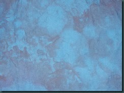
 Here are my tests of the ombre on silk commission fabric. The right-hand piece is my first large test for color; on the left is the second large test of color plus the ombre effect, and in the middle is a tiny blue rectangle that’s my color/value to match for the darkest area. It’s one of those blues that changes drastically according to the light source.

Here is a piece of snow-
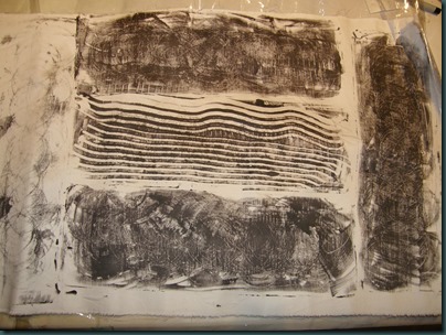
 dyed broadcloth that I used for a test of Corn Dextrin resist. The dextrin was a little too warm and thin when I applied it, so it resisted really well. However, in this white area I used my pink centipede to remove some of the dextrin, so there are some darker areas created where its legs touched.
  This is half of an ugly challenge fabric from last year, or early this year. I used it to get practice with potato dextrin. Again, too warm and thin; the best results are from an earlier application of dextrin
 .
. Finally, this is very thick black MX that was spread on the smooth side of the polycarbonate shape used above. Another petal-shaped piece of plastic was used to squish the thickened dye and lift it off. I was reminded of this technique by Sue S in the UK, and I love it! I’m glad I used an interesting shape, too!
Still on the list of stuff to play with – discharge/vat dye, if it’s nice tomorrow afternoon. Must bind up the orange/navy for that.
Thanks for looking!


2 comments:
Lisa - I love your ombre dyeing - the transition from dark to light is so smooth and gradual. Just beautiful. That blue is gorgeous. Is this a stock Procion color or something you achieved by mixing your own blend? I will understand if you choose not to share the color- we all need to have some mystery techniques just for ourselves!!! Thanks for your wonderful blog - it is a wealth of inspiration & information.
-Nancy
Thanks, Nancy. I just realized - I never mentioned which dye I used; it was washfast acid dye - (WFA from Pro Chem). I used a mixture of Brilliant Blue, which is a pure dye with a color very similar to ProChem's Intense Blue in the MX family, plus a Deep Purple, which is a blended color. I suspect the blend is a dark blue, like Navy or National Blue, plus a warm red like Fuchsia or Magenta.
Thanks for looking, and for taking the time to comment. - Lisa
Post a Comment