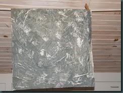
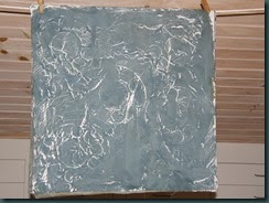
Most of these are monoprints, and one is a screen print from a screen made with polyester mesh and house paint. The latter is a new technique for me, but it seems to have a lot of possibility. Now I just need to make up some more frames.
This is a monoprint with several varieties of “black.” The colors all started with some black dye mixed at 5% and thickened. That’s not really strong enough to get a good print. The grey is mixed with 1% black dye. Then I added tangerine to one cup, and orange and blue to another. A third cup I added blue only to – a very nice blue-grey was the result.
This is the blue-grey, with ‘telephone dials’ that are the result of dropping a metal palette into the dye. The first time I did that was by mistake and I liked the pattern a lot.
The first of these two pictures is a monoprint using the various different blacks I had mixed up. The second is a ghost print with some more dye added, I think.

This was made with stronger black dye using the screen I made with house paint. It was inspired by the print from the palette. A lot of the rough areas could get tidied up. Maybe I will just make the circles crisper, though.


4 comments:
Lisa, These are really nice. My favourites are the 1st, 3rd and 4th pieces. Gotta mix up some of that black!
Kit
Thanks, Kit! I’d say the first, second and third are the best. Or are the ones I like the best. It was not a conscious choice to post them first, but oblivious has always worked well for me.
The gray ones looked like silver metallic! And the pallette as design...LOVE IT! Gonna go see what I've got... and just think, our kids are clueless about telephone dials!
The blue-grey with palette prints could be glitzed up with some actual silver metallic - thanks for that idea. I've gotten such nifty results by dropping stuff onto thickened dye. I should post on that too.
Post a Comment